Deus Logos Ex-Press

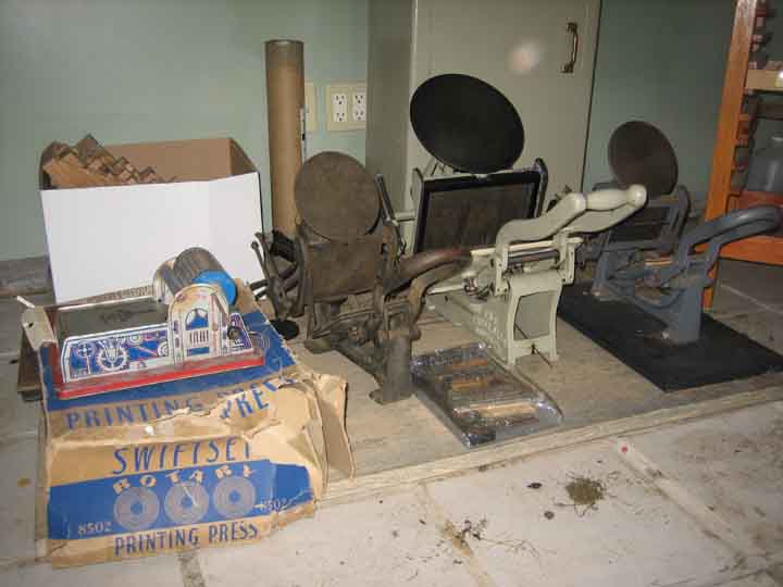
This blog is an amalgamation of the ongoing escapades of the Last Word Books Friends & Family Printing Project. We've got an old Chandler & Price Platen Press from 1934(?) named Ampersand stuffed into the back of Last Word and three old Kelsey's at Hungry Hollow Farm. Soon we will be letterpressing local poetry broadsides, beer coasters, chapbooks, flyers, LP covers, cd covers, 'zines and whatever else we can come up with.
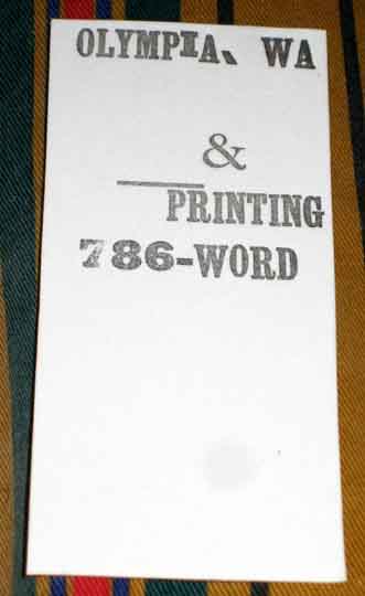
4.28.2006

Come visit us at Arts Walk 2006!

4.27.2006

Countryscape - Sustainable Design Firm


These guys have their shit together and could hook us up with awesome inks, papers, contacts, the works.

"Countryscape was formed by a collection of like-minded people, drawn together from diverse professional backgrounds, yet sharing a common concern for our natural and cultural landscape. We operate as an independent consultancy, possessing a wealth of expertise in the fields of design and communication, geographical information and landscape ecology."

Hell yeah!

On another note, this UK recycled paper company is sweet, too bad they can't deliver to us...here's their letterpress page. And, along those same lines:

Dolphin Blue - Environmentally Responsible Office Supplies

Skycraft Design - Marbled and handmade fine papers

Oh My God, I Want Three

VersaLaser™ can transform images or drawings on your computer screen into real items made out of an amazing variety of materials… wood, plastic, fabric, paper, glass, leather, stone, ceramic, rubber… and it’s as easy to use as your printer.

4.25.2006

C & P - Pressman's Favorite


Interesting old piece on Chandler and Price, the presses and the people behind them.

By Fred Williams, Editor-Publisher
Type & Press
Published Summer 1977


If a favorite press poll was ever conducted among pressmen and printshop proprietors, there is no doubt that the C&P would win all the honors, grippers down!

Pressmen loved its easy accessibility for makeready, long impression dwell, pause for feeding plus its heavy precision construction which enabled the C&P to print "run of the hook" from a postage stamp to large four-color register forms or die cutting.

Proprietors loved its ability to run just about any job profitably with practically no "down time" in spite of little maintenance.

Chandler & Price Meet 1881

Harrison T. Chandler, an Illinois banker, while negotiating to buy an interest in the Cleveland Type Foundry, met William H. Price, son of a builder of printing presses. They founded the Chandler & Price Co. of Cleveland to build printing equipment.

In 1884 the partners introduced their famous jobber in two sizes –7xll and 10xl5 and by year's end over 300 presses had been built. Subsequently the press was built in 8xl2, 14x20, 14.5x22 sizes.

The C&P was not of original design, being based on several expired patents granted to George Phineas Gordon about 1850. This famous press had a reciprocating vertical bed mounted on two long legs hinged to a shaft at the rear base of the press. This "long hinge" made it possible for the printing surface to approach the platen nearly parallel. The motion of the platen, controlled by a toggle actuated by a cam wheel, moved the bed forward at the proper sequence in the cycle.
Read More

Heavy Metal Madness: First Day at Letterpress High


by Gene Gable, creativepro.com contributing editor
Thursday, June 26, 2003


Your Guide to Letterpress on the Web
The best entry point to the world of vintage printing and composition is clearly The Briar Press. Not only is this site incredibly comprehensive and a perfect jumping-off spot to other sites, but it's very well designed and organized, and to me visually reflects the quality and integrity of the era it covers.
Read More

A decent little article with a few valuable links and some cool pictures.

4.22.2006

Our humble first project


decided to screw around a bit late last night, managed to make a mess of things right good, use a bunch of organic olive oil, got black ink all over everything and trouble-shot just about everything that could have gone wrong. made a small print run of 50 little bookmark/business cards for & Printing in the dead of night. ink wasn't dry on some of the darker ones this morning but I figured it would take longer than that out in the barn. I was impressed (ha!) that any of them were dry this morning. What fun! It's a good thing I enjoy each part of this laborious process 'cause it looks like this is what I'm gonna be doing for some time now...

we're gonna need more type, metal spacing and furniture, that's for damn sure. it's a shame the old wooden poster size fonts sell for so much money on ebay. all these rich idiots decorating their bungalos or making fancy jewelry out of this shit instead of giving it a practical use drive the price up for us poor printers who just want to use the stuff. breaks my heart. last summer we had this bloke wander into the store, buy a nice old underwood typewriter and proceed to tear it to pieces right there in the store in the name of fine jewelry. give me a break or a gun.


Cool animation of an old press in operation, sorry i couldn't get a clearer picture.

4.20.2006


oh god.

i felt bad at first when I had to go to Jade and say: "I'm sorry Jade, now we have 4 printing presses to work on instead of one."

Well now we are going to have maybe 5 to 8 presses and an entire print shop to set up. I still need to call Stu and tell him he's gonna need way more film. So in light of these new developments this blog may be changing a bit. Stay tuned.

In the meantime, here's some pictures of the three little tabletop presses I just procured from Bill Ransom early yesterday morning. One of them has a little local NW history, having been used for years by Sam Green up at Brooding Heron Press. I'm setting up a little studio out in our old barn here at Hungry Hollow over the next few days. Wish me luck.

I'm so glad that Stu interviewed Jade and I when he did, the night before I scored this entire studio from Yakima. It makes out words all the more meaningful because when we spoke them we had virtually nothing but were full of dreams and now we have everything (or soon will) and our dreams are leaking out the seams. We have yet to meet, we don't know what we're doing but we know it's going to be... quintessential.

4.16.2006

&: The History of

The ampersand is a ligature (combination) of the cursive
letters "e" and "t", invented in 63 BC by Marcus Tirus [Tiro?]
as shorthand for the Latin word for "and", "et".

The word ampersand is a conflation (combination) of "and, per
se and". Per se means "by itself", and so the phrase
translates to "&, standing by itself, means 'and'". This was
at the end of the alphabet as it was recited by children in
old English schools. The words ran together and were
associated with "&". The "ampersand" spelling dates from
1837.

Thanks Dictionary.com!

An ampersand (&, &, &), also commonly called an and sign, is a logogram representing the conjunction "and."
...The ampersand often appeared as a letter at the end of the Latin alphabet, as for example in Byrhtferð's list of letters from 1011.[1] It is thought that teaching & as the last letter of the alphabet (... X Y Z and &), a common practice through the 19th century, led to its name, a corruption of the phrase "and per se and", meaning "and [the symbol which] by itself [is] and". The Scots and Scottish English name for & is epershand, derived from "et per se and" with the same meaning.
More of the history of & at Wikipedia

4.14.2006

Dark greasy hands and light airy dreams

We came together late last night, old when-we-have-the-time friends drawn together towards fresh common ground. Over Fishtale Ales and with Fishtale's pallet-jack we hauled the hulking behemoth out of its dark corner, last year's dust thick in our lungs. Over the next several hours we assembled her, engaging the flywheel and hammering the old pin into place, making sure the teeth of the gears align, hooking the bar over the axel, attaching the ink rollers and then spinning and spinning and pedaling with joyful exuberance, the little counter slowly tick-ticking away as the ink disc makes its slow rotation. Then it was on to the bars until last call to talk about a name, which I believe we have come up with (at least tentatively). Ahhh, what happens to a dream deferred? It learns patience and then it comes back kickin'.

4.07.2006

Etymology Entry #4514267

Found out the words Cliche and Stereotype are both originally printing terms:

Cliche - originally meant a printing term for a semi-permanently assembled piece of type which could easily be inserted into the document being printed (see Block printing). It has since come to mean a phrase, expression, or idea that has been overused to the point of losing its intended force or novelty, especially when at some time it was considered distinctively forceful or novel. The meaning of a cliché may shift over time, often leading to confusion or misuse.

Stereotype - The word stereotype was invented by Firmin Didot in the world of printing; it was originally a duplicate impression of an original typographical element, used for printing instead of the original. Over time, this became a metaphor for any set of ideas repeated identically, en bloc, with minor changes. In fact, cliché and stereotype were both originally printers' words, and in their literal printers' meanings were synonymous. Specifically, cliché was an onomatopoetic word for the sound that was made during the stereotyping process when the matrix hit molten metal.

Thanks Wikipedia!

4.02.2006

Hunk of metal

platen - derived from french "platine" meaning flat piece of metal. in a platen press, the part of flat metal which holds the paper for impression.